I have replanned the the scheduling dates for the filming and editing of my music video.
Band Members and Props
Pat Mills: Vocals, Props Needed: Mic, and the Mic Stand.
Callum Wills: Bass Guitar, Props: Bass Guitar.
Sam Green: Lead Guitar, Props: Electric Guitar.
Harry Simmons: Drums, Props: Drum Kit, Drum Sticks.
Shooting/Filming
Thursday Evening
Friday Evening (Possibly)
Next Week
Monday Evening (Final Shots)
Thursday Evening (Pick Up Shots)
Altogether, this will hopefully take no longer than 6 hours.
Now I just need to confirm the location availability, and organise the band members to make sure they'll turn up.
Tuesday, 1 November 2011

Wednesday, 26 October 2011
Filming Update.
Filming took place yesterday, but due to the terrential weather conditions, the filming had to be prosponed until further notice.
This morning we have arranged to film what will hopefully be the majority of the video, this afternoon. This means that thework rate will have to be very high, but hopefully it can be completed this afternoon.
This morning we have arranged to film what will hopefully be the majority of the video, this afternoon. This means that thework rate will have to be very high, but hopefully it can be completed this afternoon.
Monday, 24 October 2011
Filming Dates.
Filming will be taking place tomorrow afternoon. I have spoken to the people who will be performing in the video, and they have all made themselves available. I will be using either one of two venues for the filming, either my garage, which I will be clearing out tonight, to see if I have enough room, if not then I will be going down to a local field and filming there.
Filming Update.
Due to Pat Mills who is playing the lead role in my music video, being away in London all week on work experience, I have not been able to complete filming for my music video. I know this leaves me with 5 day's to complete filming and editing, I am hoping to book out the school hall for filming today, and I have definitely booked out the school book for filming on Friday afternoon.
Thursday, 13 October 2011
Album Poster Analysis.
Radiohead, The King Of Limbs, situated on the back of an NME, which is fronted by Liam Gallagher and his Beady Eye clan, I doubt he's pleased with that. Anyone, back to Radiohead, a band that need no introduction, not that they particularly get one with this album poster.

The Poster has 'Radiohead' written at the top of the poster, postioned backwards, in a large white font, with the whole background being black, situated under this is the name of the album, in slightly smaller font, this could have been done for one of two reasonur the first is because it is a way that Radiohead are getting the point across that they sell an album on the status of their name, rather than the quality of their album. Secondly it could be because the album name is longer than the band name, therefore to make the presentation look the better, they've made the font smaller. Continuing in the same structure, underneath this they have the release formats, and the date of it as well.
Following the written language, we see the image that has created for, and associated with The King Of Limbs album, in some way's it could described as a filler to take up some of the space of the poster, but you would guess it's their due to the relevance of the album artwork, in which it is included on the album.
Finally, with a swap in background, and font colour. the poster states you can purchase the album from HMV, this will have been included because Radiohead will have been paid to HMV's name on the magazine, as it will give their company more exposure.
Finally, next to this is the XL Recordings logo, they will want people to know Radiohead are on their label, therefore will want to be included on the poster.
Altogether this looks quite basic, but it doesn't look bad, tacky or rushed in any case. Which gives me confidence that I could create something simplistic, that would still work well.
The Poster has 'Radiohead' written at the top of the poster, postioned backwards, in a large white font, with the whole background being black, situated under this is the name of the album, in slightly smaller font, this could have been done for one of two reasonur the first is because it is a way that Radiohead are getting the point across that they sell an album on the status of their name, rather than the quality of their album. Secondly it could be because the album name is longer than the band name, therefore to make the presentation look the better, they've made the font smaller. Continuing in the same structure, underneath this they have the release formats, and the date of it as well.
Following the written language, we see the image that has created for, and associated with The King Of Limbs album, in some way's it could described as a filler to take up some of the space of the poster, but you would guess it's their due to the relevance of the album artwork, in which it is included on the album.
Finally, with a swap in background, and font colour. the poster states you can purchase the album from HMV, this will have been included because Radiohead will have been paid to HMV's name on the magazine, as it will give their company more exposure.
Finally, next to this is the XL Recordings logo, they will want people to know Radiohead are on their label, therefore will want to be included on the poster.
Altogether this looks quite basic, but it doesn't look bad, tacky or rushed in any case. Which gives me confidence that I could create something simplistic, that would still work well.
Album Poster Analysis.
Arcade Fire, with their latest album, the critically acclaimed 'The Suburbs', released a very 'Ordinary promtional poster on the back of NME album, which coincidently, they were the cover stars, which could have been the reason they gave minimal information, since buyers of the magazine, would most probably be familiar with the band.
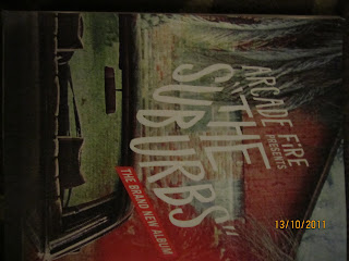
The only written context on the poster say's "Arcade Fire presents 'The Suburbs"", followed by the words "The Brand New Album" written slanted to the left in a red box. I believe the lack of writing on this works well actually, because it isn't asking readers to digest too much information, it's stating the name of the band, and the name of the album, respectively. The advantage of this is that they won't lose the readers attention, something which I could look to for inspiration when I come to complete my album.
Other than this, the backdrop to the album is album cover itself, this is example of getting the album image into the readers head, so that if they see it a shop, they will know what album it is, which could increase album sales.
Similar to many album posters, it's once again very simplistic, something that I could follow when it comes to making my final poster, as it grabs the readers attention and keeps it.
The only written context on the poster say's "Arcade Fire presents 'The Suburbs"", followed by the words "The Brand New Album" written slanted to the left in a red box. I believe the lack of writing on this works well actually, because it isn't asking readers to digest too much information, it's stating the name of the band, and the name of the album, respectively. The advantage of this is that they won't lose the readers attention, something which I could look to for inspiration when I come to complete my album.
Other than this, the backdrop to the album is album cover itself, this is example of getting the album image into the readers head, so that if they see it a shop, they will know what album it is, which could increase album sales.
Similar to many album posters, it's once again very simplistic, something that I could follow when it comes to making my final poster, as it grabs the readers attention and keeps it.
Album Poster Analysis.
This Poster was made to promote the debut album of highly anticipated band The Vaccines, 'What Did You Expect From The Vaccines'. The poster in many way's could be deemed quite simple, largely because the wiritng is keep minimal, and is kept in a black font, The name of the album is placed in large font, at the centre of the page, this is done so that people will be attracted to the Tname of the album as soon as they see it. Underneath is the date that the album was released, this is in a smaller font, nor is it in bold, simply because this isn't quite as an important piece of information, compared to the name of the album.

Other notable feartures include recommedations, and critcal success that the album has been given, such as " "The return of the great British guitar band" NME" and a four star rating off Q magazine. Obviuously these have been placed so that potential buyers of the album will see that music reviewers have given the album positves reviews, thereore this could persuade people to buy the magazine.
We also get a logo of Columbia Records, this is just because they want to make sure that people know The Vaccines belong to their label.
Also Play.com have their company advertised on the bottom right of the poster, which they will have paid. This is just because they believe this will help them expand their name.
Also the Album Cover has included on the bottom right of the page, so that now when people see the album in a show they will know that it is The Vaccines album. Also the backdrop to the poster, is the centre piece from the album itself, this helps give the poster more life, it's also the image phase The Vaccines that been going through during this album.
Overall, I believe this is the quite a simple in it's own respect, they are helping to their album into peoples minds, by having catch the readers eye, as it is based in the centre of the page. The affective simplicity is something I believe I could recreate on my poster.
Other notable feartures include recommedations, and critcal success that the album has been given, such as " "The return of the great British guitar band" NME" and a four star rating off Q magazine. Obviuously these have been placed so that potential buyers of the album will see that music reviewers have given the album positves reviews, thereore this could persuade people to buy the magazine.
We also get a logo of Columbia Records, this is just because they want to make sure that people know The Vaccines belong to their label.
Also Play.com have their company advertised on the bottom right of the poster, which they will have paid. This is just because they believe this will help them expand their name.
Also the Album Cover has included on the bottom right of the page, so that now when people see the album in a show they will know that it is The Vaccines album. Also the backdrop to the poster, is the centre piece from the album itself, this helps give the poster more life, it's also the image phase The Vaccines that been going through during this album.
Overall, I believe this is the quite a simple in it's own respect, they are helping to their album into peoples minds, by having catch the readers eye, as it is based in the centre of the page. The affective simplicity is something I believe I could recreate on my poster.
Subscribe to:
Posts (Atom)