Symphonies, a post-modern piece of art, by the underground pioneer Dan Black, isn't just an interesting piece of music, in addition to an intriguing video. Black focuses on creating a pastiche, which mocks all these multi million selling artists such as Rihanna, claiming that the work that they produce isn't all that complex.
The drum beat that was used throughout the song, was the same drum beat that Rihanna had used for her mega hit 'Umbrella', the drum beat is just from 'Garageband', a feature from a Mac, where you can create this beat, quite comfortably, Dan Black used this beat to show that Rihanna had come up with something Innovative, she had actually just used a reasonably simplistic method.
Thursday, 26 January 2012

Wednesday, 21 December 2011

Tuesday, 20 December 2011
Evaluation, Question 4, Final.
I have created a video/voiceover which recognises the variety of technogies that I've used throughout the piece of coursework, and also discussing how they've helped me...
Thursday, 8 December 2011
Evaluation, Question 3, Plan.
I have recieved feedback for my coursework from a variety of different people, through a range of different sources. The most important pieces of feedback I have recieved are from my teachers, they have given me feedback by commenting on blog spots, stating what they like, dislike, and how I can improve my work. Secondly, I have spoken to my teachers in class, where they have disscussed my progression with me.
I will also be using social networking sites Twitter and Facebook to recieve feedback for my video, ancillary texts, I will ask people what they like dislike about the media, anybody can feel free to give their opinon, when it comes to making improvements and what I could've done better, I will ask other media students, and people of my target group, because then I will find people who's opinions really do matter, no disrespect to anybody else intended, because I still feel it would interesting to see what people who like different genres think of the video, since there is nothing wrong with expansion, but I beleive opinions from my target audience is more essential.
I will also be in facilites such as the library next week, where I will ask people to specifically watch my video, then I will ask them to answer a few questions on the video overall.
Finally, I believe the expections of the examiners, and their expectations are vital, because at the end of the day, they will be the one's who are judging you. Therefore it would pointless to do something that they are completely against, because you will most probably based receive little to no prasie for it. Hence why I believe it is important to listen to what the teachers inform you, because although they will have their own preference, they will still give you guidance and feedback according to the preference of the examiners.
I will also be using social networking sites Twitter and Facebook to recieve feedback for my video, ancillary texts, I will ask people what they like dislike about the media, anybody can feel free to give their opinon, when it comes to making improvements and what I could've done better, I will ask other media students, and people of my target group, because then I will find people who's opinions really do matter, no disrespect to anybody else intended, because I still feel it would interesting to see what people who like different genres think of the video, since there is nothing wrong with expansion, but I beleive opinions from my target audience is more essential.
I will also be in facilites such as the library next week, where I will ask people to specifically watch my video, then I will ask them to answer a few questions on the video overall.
Finally, I believe the expections of the examiners, and their expectations are vital, because at the end of the day, they will be the one's who are judging you. Therefore it would pointless to do something that they are completely against, because you will most probably based receive little to no prasie for it. Hence why I believe it is important to listen to what the teachers inform you, because although they will have their own preference, they will still give you guidance and feedback according to the preference of the examiners.
Wednesday, 7 December 2011
Evaluation Question 2, Plan.
EVALUATION 2. How Effective is the Combination of Your Main Product and Ancillary Texts?
In this question you need to evaluate the sense of 'branding' you've created across your products. Once again you need to use a range of technologies to present your work.
Some tips
Pick out the elements you've chosen to carry across your work and explain why you feel these best represent your 'artist'.
There are similarities, and differences within my main product, the music video, and the ancillary products, my Dikipak and Posters. One is that the genre mix's in together, for instance my Digipak doesn't fits an indie genre because I have no actual images of the band, which is quite often the result for an indie band, when releasing a forthcoming album. This is carried into the video, because I do believe the band portray an indie image, every single member (excluding the drummer) was seen wearing a pair of shoes (Coincidently, it is once again common for the drummer of indie bands not to be as image orieentated as his peers)
Secondly, for my Digipak, I was running a back and white theme throughout. This was because The Mirrors Image are quite a dark band, in the lyrics, and songs that they produce. Therefore black and white is often renound for creating a strong colour pallet, when mixed together. So I believed it made sense for me to use this black and white theme, because the darkness it brings, which would infer to the lyrics and music of the band, and latterly the white colouring, would look light, representing The Mirrors Image being the light throughout this scene, and they would be the ones who stood out.
Admittedly, the location of music video creates a horrendous contrast to both ancillary texts. This is my own fault however, because although wasn't dedicated enough to finding a great venue for filming, and I just wanted to find somewhere I could film, no matter what the quality. I had comtemplated filming in a dark outdoor environment, which would have been in conjunction with the ancillary texts, but I was not in coalition with the weather, which I could not trust, since we had downpours throughout the filming period, therefore this idea was blown out of the window.
For the Front Cover and Poster of my Dikipak and Poster respectively, I was trying to imply a relevance to the Physcological device 'Roarschach', I was hoping to create this effect, for one because I believed it would've looked creative and very artistic if done properly. I also wanted to emulate the 'Roarschach' technique is because of the pragmatic meaning behind it, the images are supposed to challenge your mind, the play tricks with you. Therefore I wanted to imply that the album cover would play tricks with your mind, and baffle you. Due to the poor Mise en Scene though, this idea wasn't really portrayed, which was a disappointed.
The Horrors, The Courteeners and Banyshambles are just a few example of bands of have used images as their album. I believe the main influence behind this, is because of the artistic side, if you have artistic piece of imagery on an album cover, it would become automatically intriguing to the people are looking at purchasing the record, also ut helps make your album more distinctive, recognisable, should I say, making your album that little bit different to all others.
The Horrors, The Courteeners and Banyshambles are just a few example of bands of have used images as their album. I believe the main influence behind this, is because of the artistic side, if you have artistic piece of imagery on an album cover, it would become automatically intriguing to the people are looking at purchasing the record, also ut helps make your album more distinctive, recognisable, should I say, making your album that little bit different to all others.
Monday, 5 December 2011
Evaluation Question 1, Plan.
EVALUATION 1. In what ways does your media product use, develop or challenge forms and conventions of real media products?What is the question asking?
This question requires you to demonstrate how your research and planning has influenced your work. You'll need to review your research and planning posts and identify which elements from the music videos and artists you've researched have been incorporated into your final pieces.
You need to be honest, does your product 'work'?
When responding DON'T:
One image representation that I tried to stay away from was the new 'indie wave' look that started to sweep across the nation recently, with bands such as Friendly Fires, and The Maccabee's following this look. Although I did need to stick to my genre, therefore I felt the best way to go about this, was a follow a more tradional indie look, therefore I took inspiration from bands who were influenced by music from previous generations, such as The Courteeners, who are influenced by the Mod culture, and also sight The Smths as a large influence on them. This was something that I noted on original pitch, that I would take inspiration previous generations, and although I didn't completely go all out making this a music video that resembles a previous generation, I did still stick to the routes of my pitch, especially in the form of frontman Levi Strummer. I believe you could look at his image throughout the video, and he portrays a man who was influenced by previous generations. I also attempted mix this with the image of a band who know they are cool, I don't want to use the cringy phrase, but they know how to 'Give it Big' and I tried to portray by putting the bass player in parka coat, similar to one you would have seen a man such as Noel Gallagher, followed by putting the lead guitarist in a 'Pretty Green' jumper, pioneered by Liam Gallagher, so I was putting these clothes symbolised this genre of music on my band members.
If anything positive was to come out of the video, I believe it was the camera angles used. I wanted to get a lot of close ups, something you see in many in many videos today, once again by bands such as The Cribs, I did this because it cuts out anything irrevelant, there would be no need to have a long shot of Strummer when he is singing the vocals, because there would be no need to see his jeans, it's just important that you can see his mouth clearly. I also tried to get shots of the drummer hitting the actual drums, and than showing his face, this was because it makes for a better edit, because you can see the drummer hitting the beat on time, rather than seeing an image of the drummer as the music is playing, because once again this would be pointless. I carried this procedure out once again with the guitarists, showing them strum to the music, because this helped my video look like an actual video.
For my Digipak, the ideas that I had envisaged in my mind, were not those that were portrayed on the actual Digipak, I once again tried to emulate my genre, the majority of bands that I looked to for inspiration had had chosen an image, rather than a having themselves on the front cover, as that is more a 'pop'/'mainstream' thing to do. I tried to recreate a roarscharke physcological, not only did it give a deeper meaning of playing with your mind pragmatically, it also links back to bands such as The Horrors and The Courteeners, who have artistic images on their front covers. I continued to follow the inspirations from these bands for my back cover, by making it very simplistic, sticking to the black and white theme, and then just naming the tracks, along with all the legal requirements.
With my poster, I took the main image from my front cover and placed it onto the poster, I did this for one main reason, to make my band look more distinctive, so that people knew who they were looking at when they saw the image. Another technique of other bands from my genre, an example is below with The Courteeners.


This question requires you to demonstrate how your research and planning has influenced your work. You'll need to review your research and planning posts and identify which elements from the music videos and artists you've researched have been incorporated into your final pieces.
You need to be honest, does your product 'work'?
When responding DON'T:
- write an essay
- simply list points
- produce a PowerPoint
- waffle!
- claim to have been 'original' (you haven't been, it's not possible!)
- ONLY discuss your video
- Write about all THREE products
- Be creative (how can you respond in an entertaining yet informative way?)
- Use technology (e.g. photoshop, tubechop, prezi, scribd, iMovie, soundcloud, flickr etc)
- Be analytical (pick out specific examples and remember your A2 theorists as well as ones from AS. Barthes, Todorov, Mulvey, Gilmore, Goodwin, Stewart etc)
- Explain every decisions (discuss the choices you made)
- Use the correct vocabulary (longshot, verisimilitude, diegetic etc)
One image representation that I tried to stay away from was the new 'indie wave' look that started to sweep across the nation recently, with bands such as Friendly Fires, and The Maccabee's following this look. Although I did need to stick to my genre, therefore I felt the best way to go about this, was a follow a more tradional indie look, therefore I took inspiration from bands who were influenced by music from previous generations, such as The Courteeners, who are influenced by the Mod culture, and also sight The Smths as a large influence on them. This was something that I noted on original pitch, that I would take inspiration previous generations, and although I didn't completely go all out making this a music video that resembles a previous generation, I did still stick to the routes of my pitch, especially in the form of frontman Levi Strummer. I believe you could look at his image throughout the video, and he portrays a man who was influenced by previous generations. I also attempted mix this with the image of a band who know they are cool, I don't want to use the cringy phrase, but they know how to 'Give it Big' and I tried to portray by putting the bass player in parka coat, similar to one you would have seen a man such as Noel Gallagher, followed by putting the lead guitarist in a 'Pretty Green' jumper, pioneered by Liam Gallagher, so I was putting these clothes symbolised this genre of music on my band members.
If anything positive was to come out of the video, I believe it was the camera angles used. I wanted to get a lot of close ups, something you see in many in many videos today, once again by bands such as The Cribs, I did this because it cuts out anything irrevelant, there would be no need to have a long shot of Strummer when he is singing the vocals, because there would be no need to see his jeans, it's just important that you can see his mouth clearly. I also tried to get shots of the drummer hitting the actual drums, and than showing his face, this was because it makes for a better edit, because you can see the drummer hitting the beat on time, rather than seeing an image of the drummer as the music is playing, because once again this would be pointless. I carried this procedure out once again with the guitarists, showing them strum to the music, because this helped my video look like an actual video.
For my Digipak, the ideas that I had envisaged in my mind, were not those that were portrayed on the actual Digipak, I once again tried to emulate my genre, the majority of bands that I looked to for inspiration had had chosen an image, rather than a having themselves on the front cover, as that is more a 'pop'/'mainstream' thing to do. I tried to recreate a roarscharke physcological, not only did it give a deeper meaning of playing with your mind pragmatically, it also links back to bands such as The Horrors and The Courteeners, who have artistic images on their front covers. I continued to follow the inspirations from these bands for my back cover, by making it very simplistic, sticking to the black and white theme, and then just naming the tracks, along with all the legal requirements.
With my poster, I took the main image from my front cover and placed it onto the poster, I did this for one main reason, to make my band look more distinctive, so that people knew who they were looking at when they saw the image. Another technique of other bands from my genre, an example is below with The Courteeners.

Overall, I do believe I could have done the elements of this piece of coursework better, if I had given myself more time, or had organised myself better, although I'd like to think I adapted my work to make it look like I had created work relevant to my genre.
Monday, 28 November 2011
What's been happening in lessons.
In today's lesson, the 28th November, we have started think about our evaluations and how we are going to structure them, our teacher analysed question one, and spoke about what relevant features we need to disscuss in the evaluation question.
Monday, 21 November 2011
Editng.
I have completed the filming for my music video, so now the final task I need to complete is the editng, I am hoping to upload all of the footage onto a computer tonight, and then tomorrow actually start putting all the different scenes together.
Finally, in an ideal world, I am hoping that if all things go according to plan, I could've completed the editing by tomorrow, and have a completed music video.
Finally, in an ideal world, I am hoping that if all things go according to plan, I could've completed the editing by tomorrow, and have a completed music video.
Wednesday, 16 November 2011
Digipak Evaluation.

Above is my completed mock up for this years coursework, I feel content with parts of my Digipak, and other parts I believe could've came out better, and don't portray the image I'd visualised they would in my head.
First off, the front cover of my Digipak didn't go completely to plan, I was attempting to create a roarscharke esque, philosopical theory, although due to the colour transformation of the white faces, I had to create a black background, to make the contrast look acceptable. Although the postive note to this is that I was able to use a running black and white theme throughout the Digipak.As for the back cover, I have attempted to keep it rather simple, knowing that with real digipak, it works, for instance I took inspiration from The Beatles 'The White Album', I believe the simplicity worked to a certain extent, since the back cover wasn't too overbearing, therefore it didn't look tacky, and unrealistic. So in my opinon, I believe it proves simplicity can often be the most affective.
The inside cover insert, where the disk would be kept, was also kept very simple, I took inspiration from bands such as The Courteeners, and wrote a message aimed towards fans of The Mirrors Image, The Courteeners and artists alike, do this to make their pieces of work more personal to the people who buy it, as if they're a friend of the fans, I kept it simple and stuck to the back and white theme that ran throughout the DigiPak, and although it could look basic, in my opinion it was important that I didn't overcomplicate things, because it could've made my work look worse if I'd attempted to make my work look more glamorous, as I doubted that I'd be able to pull it off.
For the other inside insert, I tried to make something that was creative and somewhat artistic, by writing The Mirrors Image down one side of the insert, and reflecting it to the opposite way round on the other half of the page. I did for the pragmatics, to imply that it was like looking into a mirrors, and seeing your image, playing on the bands name, The Mirrors Image, something that bands such as The Cribs and Blur have done in the past, which is link inserts to the name of their band or album. Although I admit that the insert may look overcrowded and tacky, and to an extent, cheap, but at the same time, there is a meaning behind it, and it wasn't simply done as a space filler.
Finally, I believe some parts of my DigiPak may work, and I admit others could be improved upon, but I am happy with the geniune ideas and meanings behind the DigiPak, and the messages that I tried to put across, although the output wasn't quite the same, and the overall product in some way's wasn't what I ancipated when planning my DigiPak.
Filmimg.
I am hoping to complete the final pieces of my filming today, I have done the majority of the shots, but I just need to collect the final images of the frontman, as well as some extra shots of the guitarists.
It would be a big help if I am able to complete the filming today, because it give me over a week to edit the film in it's entirity, therefore increasing the chances of editing the music video to a higher standard, because it won't be as rushed.
It would be a big help if I am able to complete the filming today, because it give me over a week to edit the film in it's entirity, therefore increasing the chances of editing the music video to a higher standard, because it won't be as rushed.
Tuesday, 1 November 2011
Final Schedule List.
I have replanned the the scheduling dates for the filming and editing of my music video.
Band Members and Props
Pat Mills: Vocals, Props Needed: Mic, and the Mic Stand.
Callum Wills: Bass Guitar, Props: Bass Guitar.
Sam Green: Lead Guitar, Props: Electric Guitar.
Harry Simmons: Drums, Props: Drum Kit, Drum Sticks.
Shooting/Filming
Thursday Evening
Friday Evening (Possibly)
Next Week
Monday Evening (Final Shots)
Thursday Evening (Pick Up Shots)
Altogether, this will hopefully take no longer than 6 hours.
Now I just need to confirm the location availability, and organise the band members to make sure they'll turn up.
Band Members and Props
Pat Mills: Vocals, Props Needed: Mic, and the Mic Stand.
Callum Wills: Bass Guitar, Props: Bass Guitar.
Sam Green: Lead Guitar, Props: Electric Guitar.
Harry Simmons: Drums, Props: Drum Kit, Drum Sticks.
Shooting/Filming
Thursday Evening
Friday Evening (Possibly)
Next Week
Monday Evening (Final Shots)
Thursday Evening (Pick Up Shots)
Altogether, this will hopefully take no longer than 6 hours.
Now I just need to confirm the location availability, and organise the band members to make sure they'll turn up.
Wednesday, 26 October 2011
Filming Update.
Filming took place yesterday, but due to the terrential weather conditions, the filming had to be prosponed until further notice.
This morning we have arranged to film what will hopefully be the majority of the video, this afternoon. This means that thework rate will have to be very high, but hopefully it can be completed this afternoon.
This morning we have arranged to film what will hopefully be the majority of the video, this afternoon. This means that thework rate will have to be very high, but hopefully it can be completed this afternoon.
Monday, 24 October 2011
Filming Dates.
Filming will be taking place tomorrow afternoon. I have spoken to the people who will be performing in the video, and they have all made themselves available. I will be using either one of two venues for the filming, either my garage, which I will be clearing out tonight, to see if I have enough room, if not then I will be going down to a local field and filming there.
Filming Update.
Due to Pat Mills who is playing the lead role in my music video, being away in London all week on work experience, I have not been able to complete filming for my music video. I know this leaves me with 5 day's to complete filming and editing, I am hoping to book out the school hall for filming today, and I have definitely booked out the school book for filming on Friday afternoon.
Thursday, 13 October 2011
Album Poster Analysis.
Radiohead, The King Of Limbs, situated on the back of an NME, which is fronted by Liam Gallagher and his Beady Eye clan, I doubt he's pleased with that. Anyone, back to Radiohead, a band that need no introduction, not that they particularly get one with this album poster.

The Poster has 'Radiohead' written at the top of the poster, postioned backwards, in a large white font, with the whole background being black, situated under this is the name of the album, in slightly smaller font, this could have been done for one of two reasonur the first is because it is a way that Radiohead are getting the point across that they sell an album on the status of their name, rather than the quality of their album. Secondly it could be because the album name is longer than the band name, therefore to make the presentation look the better, they've made the font smaller. Continuing in the same structure, underneath this they have the release formats, and the date of it as well.
Following the written language, we see the image that has created for, and associated with The King Of Limbs album, in some way's it could described as a filler to take up some of the space of the poster, but you would guess it's their due to the relevance of the album artwork, in which it is included on the album.
Finally, with a swap in background, and font colour. the poster states you can purchase the album from HMV, this will have been included because Radiohead will have been paid to HMV's name on the magazine, as it will give their company more exposure.
Finally, next to this is the XL Recordings logo, they will want people to know Radiohead are on their label, therefore will want to be included on the poster.
Altogether this looks quite basic, but it doesn't look bad, tacky or rushed in any case. Which gives me confidence that I could create something simplistic, that would still work well.
The Poster has 'Radiohead' written at the top of the poster, postioned backwards, in a large white font, with the whole background being black, situated under this is the name of the album, in slightly smaller font, this could have been done for one of two reasonur the first is because it is a way that Radiohead are getting the point across that they sell an album on the status of their name, rather than the quality of their album. Secondly it could be because the album name is longer than the band name, therefore to make the presentation look the better, they've made the font smaller. Continuing in the same structure, underneath this they have the release formats, and the date of it as well.
Following the written language, we see the image that has created for, and associated with The King Of Limbs album, in some way's it could described as a filler to take up some of the space of the poster, but you would guess it's their due to the relevance of the album artwork, in which it is included on the album.
Finally, with a swap in background, and font colour. the poster states you can purchase the album from HMV, this will have been included because Radiohead will have been paid to HMV's name on the magazine, as it will give their company more exposure.
Finally, next to this is the XL Recordings logo, they will want people to know Radiohead are on their label, therefore will want to be included on the poster.
Altogether this looks quite basic, but it doesn't look bad, tacky or rushed in any case. Which gives me confidence that I could create something simplistic, that would still work well.
Album Poster Analysis.
Arcade Fire, with their latest album, the critically acclaimed 'The Suburbs', released a very 'Ordinary promtional poster on the back of NME album, which coincidently, they were the cover stars, which could have been the reason they gave minimal information, since buyers of the magazine, would most probably be familiar with the band.
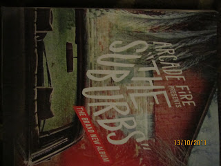
The only written context on the poster say's "Arcade Fire presents 'The Suburbs"", followed by the words "The Brand New Album" written slanted to the left in a red box. I believe the lack of writing on this works well actually, because it isn't asking readers to digest too much information, it's stating the name of the band, and the name of the album, respectively. The advantage of this is that they won't lose the readers attention, something which I could look to for inspiration when I come to complete my album.
Other than this, the backdrop to the album is album cover itself, this is example of getting the album image into the readers head, so that if they see it a shop, they will know what album it is, which could increase album sales.
Similar to many album posters, it's once again very simplistic, something that I could follow when it comes to making my final poster, as it grabs the readers attention and keeps it.
The only written context on the poster say's "Arcade Fire presents 'The Suburbs"", followed by the words "The Brand New Album" written slanted to the left in a red box. I believe the lack of writing on this works well actually, because it isn't asking readers to digest too much information, it's stating the name of the band, and the name of the album, respectively. The advantage of this is that they won't lose the readers attention, something which I could look to for inspiration when I come to complete my album.
Other than this, the backdrop to the album is album cover itself, this is example of getting the album image into the readers head, so that if they see it a shop, they will know what album it is, which could increase album sales.
Similar to many album posters, it's once again very simplistic, something that I could follow when it comes to making my final poster, as it grabs the readers attention and keeps it.
Album Poster Analysis.
This Poster was made to promote the debut album of highly anticipated band The Vaccines, 'What Did You Expect From The Vaccines'. The poster in many way's could be deemed quite simple, largely because the wiritng is keep minimal, and is kept in a black font, The name of the album is placed in large font, at the centre of the page, this is done so that people will be attracted to the Tname of the album as soon as they see it. Underneath is the date that the album was released, this is in a smaller font, nor is it in bold, simply because this isn't quite as an important piece of information, compared to the name of the album.

Other notable feartures include recommedations, and critcal success that the album has been given, such as " "The return of the great British guitar band" NME" and a four star rating off Q magazine. Obviuously these have been placed so that potential buyers of the album will see that music reviewers have given the album positves reviews, thereore this could persuade people to buy the magazine.
We also get a logo of Columbia Records, this is just because they want to make sure that people know The Vaccines belong to their label.
Also Play.com have their company advertised on the bottom right of the poster, which they will have paid. This is just because they believe this will help them expand their name.
Also the Album Cover has included on the bottom right of the page, so that now when people see the album in a show they will know that it is The Vaccines album. Also the backdrop to the poster, is the centre piece from the album itself, this helps give the poster more life, it's also the image phase The Vaccines that been going through during this album.
Overall, I believe this is the quite a simple in it's own respect, they are helping to their album into peoples minds, by having catch the readers eye, as it is based in the centre of the page. The affective simplicity is something I believe I could recreate on my poster.
Other notable feartures include recommedations, and critcal success that the album has been given, such as " "The return of the great British guitar band" NME" and a four star rating off Q magazine. Obviuously these have been placed so that potential buyers of the album will see that music reviewers have given the album positves reviews, thereore this could persuade people to buy the magazine.
We also get a logo of Columbia Records, this is just because they want to make sure that people know The Vaccines belong to their label.
Also Play.com have their company advertised on the bottom right of the poster, which they will have paid. This is just because they believe this will help them expand their name.
Also the Album Cover has included on the bottom right of the page, so that now when people see the album in a show they will know that it is The Vaccines album. Also the backdrop to the poster, is the centre piece from the album itself, this helps give the poster more life, it's also the image phase The Vaccines that been going through during this album.
Overall, I believe this is the quite a simple in it's own respect, they are helping to their album into peoples minds, by having catch the readers eye, as it is based in the centre of the page. The affective simplicity is something I believe I could recreate on my poster.
Digipak Analysis.
With their album Wall of Arms, The Maccabee's did something very rare with their digipak, they simply created a fold out poster, which was an enlarged image of the album cover. The reason behind why the band would have chsoen to do this will have been because, they know people do enjoy to get something extra, at no cost. This front cover and digipak, is 'Pop Art' esque image, something in which the band are renound for, and they also look as if they've had a plasticine tint to them.

Another reason why The Maccabee's may have chosen to have done this is because they know most people recieve their music online now, and maybe do not actually see the need to create a good, strong, defining digipak nowaday's.

Nonetheless, I amend The Maccabee's for trying to be slightly different and not creating a typical digipak. Although, this isn't something I would consider when creating a digipak, due to the fact I'd be accused of laziness, and having a narrow though process.
Another reason why The Maccabee's may have chosen to have done this is because they know most people recieve their music online now, and maybe do not actually see the need to create a good, strong, defining digipak nowaday's.
Nonetheless, I amend The Maccabee's for trying to be slightly different and not creating a typical digipak. Although, this isn't something I would consider when creating a digipak, due to the fact I'd be accused of laziness, and having a narrow though process.
Subscribe to:
Posts (Atom)